


REVEALED - The end of the Cycle
The precise date and level when this cycle will peak

Cut to the Chase
The peak of the current market cycle will be in Dec 2028 at an average UK House Price (Nationwide data) of £374,985. So, now you know.
You Sound Pretty Sure of That
Of course, no one knows exactly where this current cycle will top out. However, as investors we need to take a position - just saying “I don’t know” will not cut it. Every investor’s current buy, sell or hold decisions should be guided by when and how high we estimate the market to peak. It’s buy and hold as we run up to the peak and then try to be fully-sold before it all goes pop - simple. All investors need to plan this activity as the cycle unfolds and completes, I merely share my current thoughts and what is driving my investment decisions right now. First let me explain how I arrived at the time of Dec 2028.
Explanation of How I Came up With Dec 2028
As investors we will all have our own signs to determine if the market is peaking. Some of you might already be taking cabs you do not need, waiting to hear the apocryphal taxi driver tell of the latest buy-to-let they have added to their portfolio - a reliable indicator of the coming crash. Others will be scanning planning applications for the tallest building just about to go into construction, another hardy perennial of the market collapse signals.
Others still are merely sitting back and using cycle theory to determine the future peak of the market and until recently I was one of their number. I put some thoughts on the most famous of these cycles, the 18 year, here recently. I felt disloyal in moving away from the 18 year theory. However according to the model by 2024 we should be in the mania phase of the ‘winner’s curse’ right now - the market should be flying but is in fact flat or falling. We’ve been out viewing a steady flow of repossessions around the UK of late, it does not feel like a curse to be out buying at the moment, quite the opposite.
So how else can we put a pin in the date of the of this market cycle?
Just imagine there was a daily marketplace where the world’s biggest banks and investment houses were betting on just this date. Their collective brains would trump anything based on taxi drivers, tall buildings or cycles. Of course there is such a marketplace - The Future Curve of Swap Rates for 3-month Duration. Just what the hell is this I hear you ask. Well unlike the daily swap (spot) rate which is used as the basis of fixed rate mortgages, this forward curve is used to determine the level set for variable rate financing. In essence, this curve is the market-wide guess at what UK interest rates will be at any given time in the future for short term (3 month) money:

We can misuse this curve for our own purposes as property investors. If we accept that as the peak of the property market approaches the Bank of England will hike rates to dampen activity then we have a big clue as to when the next house price peak will occur, according to all the city analysts in any case. The curve in the graph above drops from the current level of 5.2% to 3.4% by mid 2028 before then going back up - bingo! Although the curve is not intended for this purpose, we can use this as a proxy for calling the next market peak soon after mid 2028 so let’s say Dec 2028. [18 year cyclists - it’s 2 years after your predicted peak of 2026. Covid put life on pause for 2 years - can we be friends again?].
Given that this is based on the expertise of the best and biggest banks and investors around the world then surely this must be right? Well let’s look how they have done in the past in guessing rates in the future:

[Warning - it gets a bit nerdy here, skip it and you miss nothing] This is a so-called ‘hairy chart’ and the grey curves represent the guesses of the market to the future rates at any given time. What is striking is that the grey line guesses rarely match up with the blue line of what rates actually were. For example, look at the hairy grey line coming off June 2009 following the GFC, the suggestion then was that rates would hit 4% by 2012. Of course that time was fairly unique as we entered the long period of near-zero rates. A few bankers made a lot of money by guessing this correctly, the geezer-economist Gary Stevenson being one of them. Does this undermine the method of guessing when rates will start to rise? Well maybe but beyond using tea leaves or crystal balls it is the best method I can find to guess the end of the cycle and the good news is that it is updated daily here (free to register). Investing is an iterative process, when the facts change we need to change our investment stance so this is a constant activity.
How High Will the Peak Price Be?
Loyal readers will know and perhaps share my love of the simple Nationwide graph below of real house prices against trend growth:

At it most basic, we use this to decide to buy when the blue line is below the red one and sell when it’s above. We have a model on timing the buy, sell or hold which goes into more depth but this simple analysis will do us for now.
At this point, we need to talk about the red trend line. When we first starting using this graph in 2008, the trend line was set at 2.9% per year. This gets revised every quarter and due to the lower inflation / growth period since the GFC it now sits at 2.4% per year in the above graph. It would be sensible to say that as this cycle completes, we will not see the explosive growth we have seen in the past and we should trim the trend line further down to 2.2% per year. But how does this tell us how much house prices will be at the peak? As this cycle should complete at the end 2028 and prices be above the trend line a reasonable plot is the following:
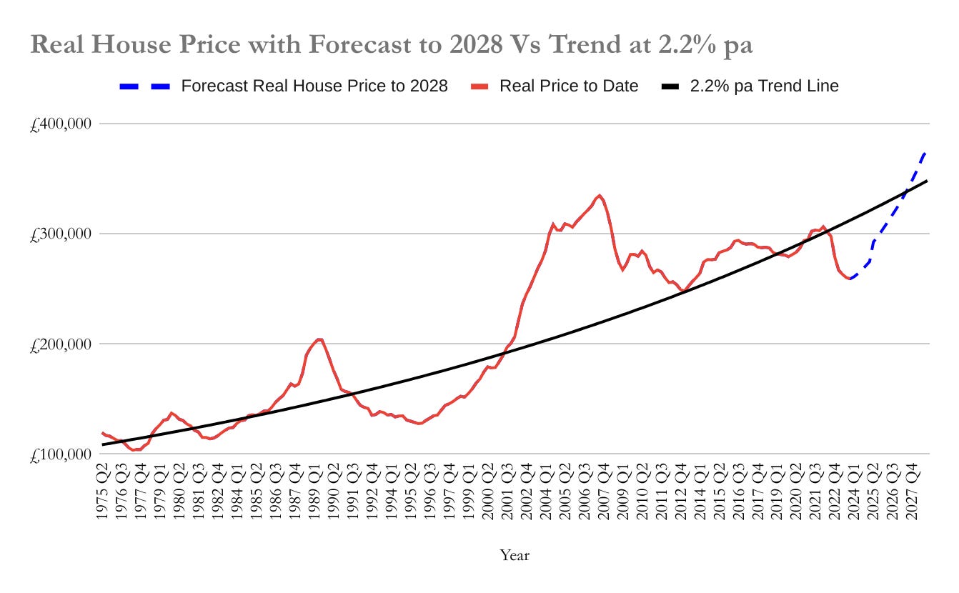
Getting around 10% above the trend line by the peak, we end up at a price of £374,985. That is to say, from today’s price levels of £260,000 we should be expecting an increase of 43% on the average UK house price. Previous peaks have gone 40% above the trend line, so why did I cap it for this cycle at 10%? Looking at FTB affordability which Nationwide also produce the cost of a mortgage usually hits around 45% of take-home pay at the market peak. If wage rises follow previous trends and mortgage rates are around 5% at the next peak then we will be running into 45% affordability when we are just 10% over the price trend line.
You’re Just Making it Up As You Go Along
Of course, all this is just guesswork but it is the best guesswork we can do based on the relevant data we have available. The data takes into account mortgage rates, wage inflation, general inflation and previous cycle performance - the key determinants of future market direction. If you are going to make a decision based on the time and level of the next market peak, and you should, this is a decent way of doing it (triangulate with taxi driver comments and measure high buildings if you must). And remember, the future swap curve gets updated daily and the Nationwide index monthly so you can adjust your stance as the cycle unfolds.
So, final question to you. If you knew for certain that in just under 5 years that the market would increase by 43% and promptly crash, what exactly would you do today with your investible funds and how would you structure your current portfolio? That is the question us investors need to answer daily. Hopefully this framework, along with the buy, sell and hold model, help you answer it and make bigger gains as a result.