
The One Property Statistic I Hate

This feels like a betrayal. Nationwide publish some of the best stats in the property industry, they put them out there for free and I nick them to use in this blog to make myself look clever. So why have I thought it important enough to dedicate a whole blog to slag off one of their stats? It’s this one, and it’s a stinker:
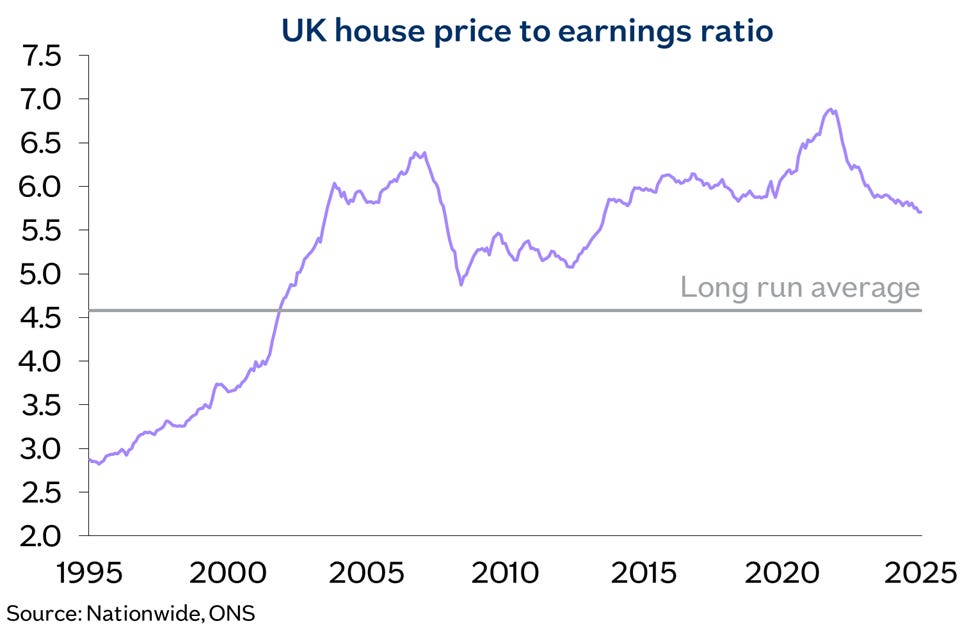
It’s just a graph that goes up and (mostly) to the right, same as all the others, so why the rage? It’s because the narrative of the current property market is hugely skewed by this House Price:Earnings (P:E) ratio and if taken on face value it’s easy to make the case that you would be a mug to be buying anytime soon. Doomsters will easily point to the long run average line and rightly claim how far above it we are today. Mean reversion is like gravity and prices must fall, they will cry. And seeing as I want to sell all our property and retire ASAP, that’s really annoying.
So, let’s try to destroy this argument point-by-point and prove that actually houses are fairly priced right now and my retirement is not too far away.
Point #1 - look at the above graph and compare 2022 (Truss) with 2008 (the Global Financial Crisis). In 2008 the world ended, you could not give property away and we are still feeling the effects to this day. So in 2022 how is it we hit a higher P:E and nothing happened? OK, the Truss impact was not nothing but the market certainly did not feel anything like as toppy as it was in 2008. Despite mortgage rates rising rapidly, nominal house prices just went sideways in response whilst real earnings nudged up. So why did a higher P:E in 2022 have much less of an effect than before? Let’s reveal than mystery….
Point #2 - we need to talk about wages, or more precisely household disposable income ie what’s left after direct taxation. This takes into account the increase over time of dual income households, in other words two wages to pay the mortgage. In real terms, mean household income was around £19,000 in 1978 and £43,000 today:
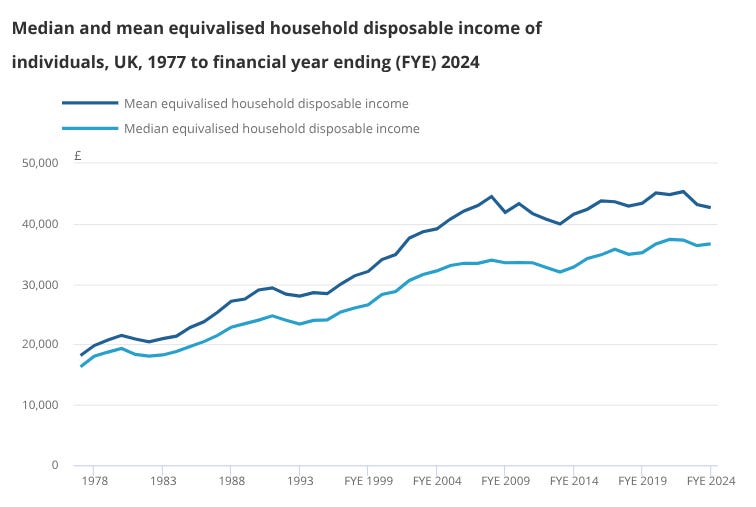
In real terms then the household income has more than doubled over this period. The Nationwide P:E ratio only takes into account the average wage of one earner and hence is misleading in terms of the firepower available to service a mortgage.
What does that mean for today’s house prices?
Point #3 - In real terms since 1978, average property prices have doubled, almost exactly in line with the increase in household income:
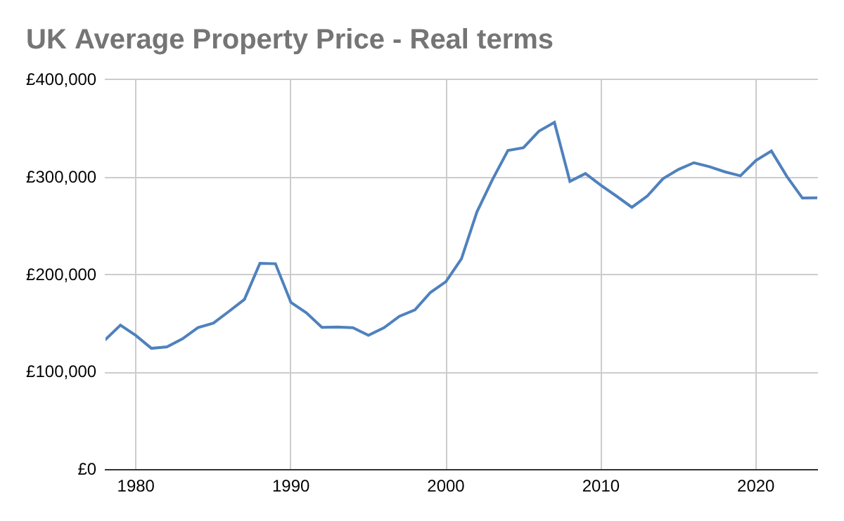
In 1978 Q4 the real house price was £133,000 and today it is £272,000. With respect to household income houses are currently as fairly valued as in 1978 - wow.
But wait, one more point…
Point #4 - Most buyers, especially FTBs, buy with a mortgage. Just how have interest rates changed since 1978? Oh, they have fallen off a cliff:
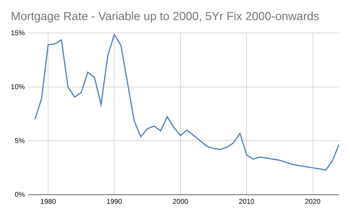
The data in the above graph uses the prevailing variable rate up until 2000 as this was the most popular type of mortgage at the time. Since then, 5 year fixes have typically been most common so we used those rates.
This collapse in rates makes a huge difference to how much of a chunk a mortgage takes from the household income. So my final graph, one that even I cannot quite believe is how much of a chunk out of household income this represents since 1978:
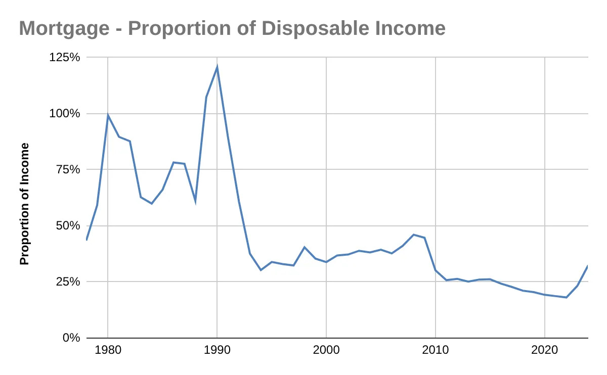
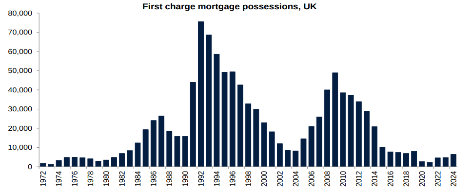
Just wow. Look at the periods in 1980 and 1990 when interest rates hit their peaks of around 15%. Back then the average household income could not even cover the mortgage. Does that seem mad? We need to remember the periods of 15% interest rates were fairly short-lived. Also, it really only affected buyers who bought near the peak of the market at that time. Rates shot up, they got burned out and between 1990 to 1995, around 345,000 homes were repossessed.
If it still seems unbelievable, let me share a personal anecdote. I bought my first property in 1990 Q4 in the wake of the crash in 1989 so let me show the numbers from back in the day:
Purchase price - £57,500 (almost the exact average house price at the time).
Take Home Wages - £950 (approx)
Mortgage Interest - £536.11*
Repayment element - £71.40*
*these 2 numbers are exact, printed on my mind forever.
I bought from a young family who were repossessed - their stay was sadly short and they had paid £90,000 for the house in 1987. Despite I got a chunky discount from peak prices and working a good job with accelerated promotion in the military I still needed to work evenings as an electrician and some holidays at Sainsbury’s (Beers, Wines and Spirits Dept - busman’s holiday) to stay afloat. This reminds us how painful the market has been in the past and the lower level of household income that a mortgage represents today gives us confidence in the health of the current housing market.
Sum Up
Can you see why I hate the Nationwide’s P:E stat now? By ignoring the dramatic real-terms rise in household disposable income and the lower mortgage rate environment it covers up that house prices* are in general now very fairly priced. As an investor, if you focused on the Nationwide stat, you would be hunkering down for falls in prices. On the contrary, any combination of improved sentiment, further falls in interest rates or real wage increases are more likely to support future price rises. And then finally I can sell up and retire.
* outside of London, that’s still toppy.